![]() Sign writers Traditional Signs of London producing sign writing in Bloomsbury for a long established book shop.
Sign writers Traditional Signs of London producing sign writing in Bloomsbury for a long established book shop.
The Clients had restored the fascia after it having needed a renovation.
They had the background painted in a buttermilk . . . . so pretty much an off white.
Originally they had wished for a bright yellow & bright green. This was how they had the old sign board prior to restoration.

I suggested a darker green colour with a paler yellow would tone better.
The client agreed & suggested they would repaint the window frames & entrance door to match once completed.
I could see the pale yellow problem they had previously but it just needed to have more pigment of green or orange tint, not be a brighter yellow
I did actually feel their old sign had nice weight to the letters & was well spaced but they requested a lot heavier & bolder as they felt it didn’t stand out enough.
This is a common error the layman has when it comes to image & signage. I personally would’ve just spread the wording more apart (kerning) & had a deeper set shadow, but they insisted on a much bolder letter style, which I obliged with.

Due to the type of colours being used, an undercoat for the pale yellow was needed & also a 2nd coat for the green was needed as it didn’t cover too well & grinned a little.
A fast drying flat beige/yellow was used for the undercoat, which allowed the 2nd coat to be applied as soon as all the letters were shadowed.


The bold look was the clients wishes, but as was the ‘dropped’ J.
If the J had been upper case the other lettering, the whole wording could’ve been not only better positioned between the top & base of the facade but would then have less need to be as bold as they has it.
Sometimes as sign writers you can only lead a horse to water as an opinion.
Ultimately they are the paying customer so they get what they are happiest with, but that doesn’t mean to say the customer is always right, just the customer always gets a completed job they are content with.
Its their business not mine. I just offer a specialists opinion.
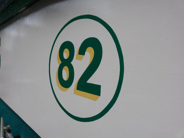
Matching numerals were added either side of the shop name.
The client originally suggested just green numerals with a yellow circle, but I suggested it would be more destinct if all green with the yellow as the drop shadow.
Once completed the client agreed it was the better option.

The bookshop fascia signwriting completed.
The following day a descriptive subtext was required above the entrance door.
The layout was produced & reliefed onto the surface in charcoal, once centred.

Even though the work was carried out on a Sunday, the shop is open 7 days a week, so the customers had to still have access to the shop.
This did cause some delay & frustration, as there was a lot of on off the ladder.
This is just something sign writers get used to as part of our job.
It just meant the letters directly over the door were produced last.


They would just benefit from better lighting rather than ugly & not centred strip lighting

The signwriting thick set block letters matched the font they had printed on the awning, which is probably why they were reluctant to change from the requested look.

I think the whole shop would benefit from being only one single background colour, but again thats only a professional eye on appearence & not what the clients may feel.
It just looks dated still. hopefully not this dated!

Traditional & Contemporary signs produced by sign writers
Traditional Signs of London
info@traditionalsignsoflondon.uk