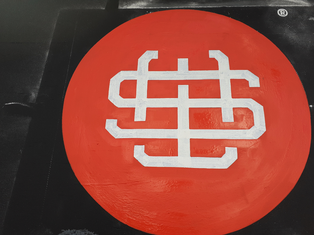
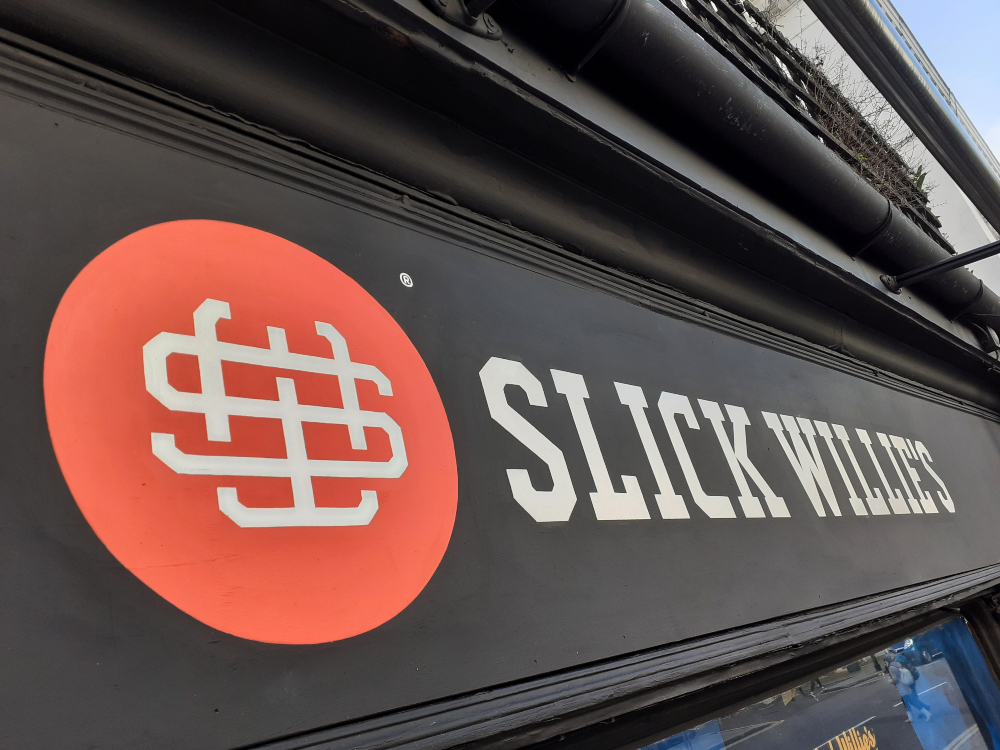
 Shop signs produced in Kensington for a long standing skateboard shop, which is having a re-branding. The clients were re-fitting their premises & also were implimenting a fresh branding for a more contemporary appeal. Traditional Signs were contracted to produce the signage on their retail outlet fascia. The branding artwork was supplied, so had to be converted into a paper template at the ideal size which would then be reliefed to the fascia panel for signwriting.
.
.

.
.
The artwork supplied by the designers is given in a digital vector file. This is converted to a paper layout/template at the size measured & ideal for the shop front. This is produced prior to the day of production on site. The layout is pin pricked to allow for ‘pouncing’ the image to the fascia on site. Once on site the first stage is to measure the fascia panel & ensure the measurements are correct, to find the points of centre (if the branding is to be placed centrally) & offer the layout/artwork into the best placement, ensuring its centred & wording is level. Guide lines are drawn on the layout artwork to marry up those marked on the fascia.
.
.

.
.
The close up image of the artwork shows the pin pricks & lines drawn to ensure of correct measured placement. Powder is then padded over the artwork to relief the image to the fascia. This gives a great guide for the signwriting to be painted to. This is more acurate than the old method of sketching lettering on site. For prodcing hand drawn old style signage sketching is still a good mathod, but for acurate designed branding, these days the pouncing of the artwork is more advised.
.
.

.
.
The signwriting can then be started with the artwork reliefed & visable to paint to. Shop signs are generally a ready prepared painted wooden fascia. This was the case on this project, with the background colour a deep charcoal grey. With painting light colours, on this colour background all signage would require two coats of paint to make fully opaque.
.
.

.
.
The logo of the company is two colours & due to this would require the most time taken to produce & would require more dry time. So the first coat of the specific shade of red is applied. It was matted down to make a quicker drying time. Care was taken to ensure neatness but also a good coverage given. While this was drying, the company name was painted using specialist brushes to give neat crisp lines. This too would require two coats of paint as it was to be in white.
.
.

.
.
By the time all the branding lettering had been painted the red roundel had dried enough to have the white monogram detailing painted. Care is then taken not to paint too close to the edges of the white lines, as the 2nd coat of the red is applied to the roundel.
.
.

.
.
A 2nd coat of off white is then applied to the lettering to give quality opacity to the shop signs & also any touch ups to the lettering edges can be produced if required.
.
.

.
.
The project is completed by cleaning off any excess markings & powder used in the reliefing of the image pre painting. The clients were very pleased with the result & sent though images of both the shop re-opened & also with the owners, staff & their best customers all showing the approval!
.
.

.

.
Hand Painted Traditional & Contemporary Sign writing in London
Sign writer: Traditional Signs of London
